


Learning how to improve conversion rates doesn’t have to be rocket science. Just think about going to the grocery store. It’s hard to pick out what you’re looking for when the aisle is crowded, the labels are overwhelming and the music they’re playing in the background is a bit too loud. You can pinpoint your favorite cereal and get out of there in minutes if you need to.
You can design your website like an extra large grocery store — with long aisles and a little too many options, or a fine restaurant, with just a few select items on the menu and an idyllic ambiance. (Which customers stay longer? The fine restaurant diners!) Let’s put this into action then!

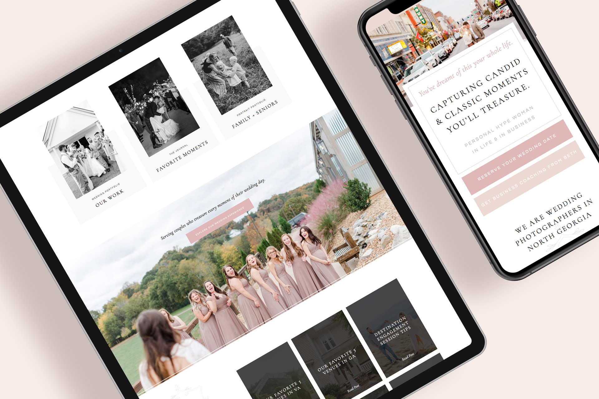
A quick look at how to improve conversion rates
- Don’t hide the menu
- Optimize for mobile
- Add clear calls to action
- Simplify your contact form
- Be strategic above the fold
- Shorten the load time
- Present only a few services
- Use white space
- Make sure the copy is readable
- Add an SSL certificate
- Be personable
Don’t hide the menu
Your menu is the only road through your website. Don’t hide it! Make it front and center so users can get around easily.
Optimize for mobile
More than 40% of website traffic is from mobile phones. Users are finding you and looking at your website from their cell phones. Don’t make it hard for them to get around. Your mobile look should be just as well designed and easy to navigate as your desktop design.

Add clear calls to action
The only way to convert users is to tell them what to do. Don’t leave anyone wondering where to go next. Use your home page to guide users to your services page or blog. As for your services page, the goal should be for them to hit the contact button. Think this through and be direct on every page!
Simplify your contact form
Ouch. Imagine a potential client going to your contact page only to be overwhelmed by the questions and required fields. Don’t make it a burden to contact you. That leaves a bad impression and some may draw conclusions about your entire process. Some might ask, “If the first form is this complicated, how tricky will the rest of the process be?”
Ask only for the essentials (name, phone number, email, how you found us) and just one or two other details. Only require those essential fields!
Be strategic above the fold
The content you see when you first look at any website page is what’s considered “above the fold.” What you scroll down to look at is “below the fold.” (This comes from newspaper terminology if you’re curious!)
What users see above the fold, or in other words, in the first few moments on your website, is what will determine if they stay or go. Be careful about what copy, photos and other elements you feature first! Try to hit their pain points and use engaging imagery.

Shorten the load time
Don’t let a slow website ruin your business. If your website takes too long to load, users won’t hesitate to change their mind and head back to where they came from. If you’re wondering how to improve your load time, or how slow your site really is, put your website into this PageSpeed Insights test from Google.
Here’s what I recommend to shorten the load time:
- Compress your photos. You don’t need huge-res photos for websites! If you’re a photographer, use the glossy setting on this image compressor to decrease the file size without losing quality.
- Don’t upload large video files.
Present only a few services
If you offer too many services, you could confuse potential clients. Condense your offers into 3 main packages if possible. Any other custom services can be presented on request or listed in an “A la carte” section.
Use white space
White space is the amount of literal blank space you have in your design. See the gap on this post to the left of this text? That is white space and it prevents the text from feeling way too close to the edge of the screen. White space gives your entire website from the text to the photos room to breathe.
Just think of your website like a magazine. The most stunning magazines have strategic placements with ample spacing between content so you don’t get overwhelmed or distracted.

Make sure the copy is readable
Readable copy, i.e. words that can easily be read, is very important for conversion rates. Small font sizes or hard-to-read fonts lead to distrust and higher website bounce rates (more people leaving your site).
Add an SSL certificate
Have you ever visited a website and received a message that it’s “unsafe?” This is often due to a missing SSL certificate, which is a low-cost item you’ll pay for annually through your website provider. This secures your website and makes sure that users don’t receive this error when trying to open your site. (If you use Showit like I do, this cost is included in the subscription and their team will set it up for you!)
Be personable
Buying something or inquiring through a website you’ve never seen before takes a certain amount of trust. By adding your name, photo and human elements, you’ll create a level of trust that can increase conversion rates.

See? Learning how to improve conversion rates is really just a matter of a few simple steps, and they’re fun in my opinion! Explore more web design tips.


